Quality of work
When it came to my work as a whole I found I achieved exactly what I wanted and went above and beyond what I thought I was capable of, initially when I'd started this work I thought that achieving my goal meant holding myself back, by this I mean I wanted to create a charcoal piece due to its type of styling but I wanted colour and nothing could work with the same effect so I had to move into doing this on photoshop to create what it was I wanted to create.
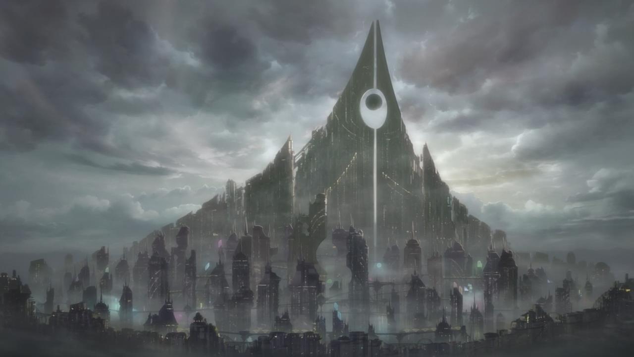
Though I doubted using myself with photoshop, for my first image that I'd tried to imitate that of Kekai Kotaki and Richard Anderson I impressed myself with what I'd created, it looked novice compared to their work as I wasn't as capable of creating art as they were, but I learned new skills by trying to do this project and getting through the end of it.
Production Skills
When it came down to what I knew against what I'd need to know to create my art, I was lacking in knowledge, but through the process of trial and error I found myself working with different tools that actually resembled what the Concept artists I'd researched do, It was great to experiment with different types of tool types, originally I only knew how to edit images with photoshop but when it came around to actually creating art I got my head around playing with different levels of opacity, different ways of blending layers, ways of making things incredibly subtle but amazingly effective in the end of the piece.
Other than working with digital software, I feel that working with charcoal has boosted my knowledge of drawing techniques in and around the industry of concepts art, I worked well with learning how to do new things by imitating the art of concept artists I've known for so long.
My expectations and my end outcome
At the start of the project I feared I wouldn't create anything close to what Concept artists do as it'd be my first time trying to copy what it is they do without any knowledge what so ever, when I was working with physical tools to create my product I knew I was limited to what it would be by the end of the project, I knew I couldn't make something anything close to what they create, until I'd scanned my work and started to draw over it and edit it with photoshop I found myself making something that somewhat resembled their work and I started to impress myself with it, as I made more progress using photoshop with my art I expected more of myself as there was so many little things I could do to edit my work and make it appealing in different ways, by the time it came to the outcome of my work I knew that it had to have a certain theme, it had to be different than what I'd anticipated otherwise I wouldn't be showing any variance in my choice of work, when I started working on my outcome I wanted to create something that took place outside, inspired by images I've took previously which meant I'd have a bright picture, but I changed this with my final outcome to be an image that took place at night to see if I could test what I'd newly learned.
With my outcome I find I surpassed what I thought I was capable of due to all the new small things I'd learnt in the trial and error phase.
Time Management
I feel like when it came down to it I was making faster progress than I had wrote down in my schedule, I was going above and beyond what I needed to do, but when it came down to the last few weeks I had myself focusing too much on my final outcome that I hadn't enough time to do most of my uploading of work online so I was scrambling for time.
As you can see from my schedule my production was taking more time than I'd anticipated so I had to spend more time in that whilst lessening my time on the presentation work.
Summary
Overall I feel like I created something that I wasn't aware I could come close to creating, I followed my ideas and stuck to what it was I wanted to create at the end of the project, though I could of found more use in creating more images to work around, I find the work I have to be enough to show what I've learned in the process of creating my art.
If I could go around to doing this again I would of sooner moved into using photoshop and creating my art as once I'd done that I would of been able to figure out what It was I needed to do to create my product.
Monday, 23 February 2015
Task 5 - Production
Initial approaches
When it came down to creating my final product, I had to look back on my previous work which I used for Ideas generation, on my piece I used charcoal initially to create a smudged effect, which I've pictured below
my result of using the smudging tool as a replacement for charcoal gave me this outcome;
When it came down to creating my final product, I had to look back on my previous work which I used for Ideas generation, on my piece I used charcoal initially to create a smudged effect, which I've pictured below
Once I got this, I used photoshop to create a charcoal effect, I did this using the smudge tool with the finger painting option enabled
Doing this makes it possible to create a charcoal effect, as it looks like it's been smudged across the canvas with someones finger, simulating the process of using charcoal to create shading.my result of using the smudging tool as a replacement for charcoal gave me this outcome;
I like this as with the use of charcoal I can make really heavy shading and make objects look entirely outstanding from one and other, the use of black and white makes a really heavy contrast between background and foreground, though using the smudge tool makes me very limited when it comes down to anything other than using the smudge tool as it would get rid of the effect i'm aiming for.
With my previous work, I'd found that using the smudge tool was the way forward when it came to me creating my concept art for my final product, with this I knew I wanted to create a forest themed area as it's possible to create a simple grass or leaf effect with the smudge tool as it can be made to tile itself.
By going over images I took under my research I could create concept art using the smudge tool to create an effect that was imitating that of the Concept artists with subtle movements, my initial beginnings looking like this;
Once I'd started like this I got around working the rest of the image with the same idea, using the colours from the image I could closely imitate the picture I took, working into closely copying the image I took, but adding small flares and differences to the image to make it more like my own image, to add to this I changed it so that the image was at night, bringing down the toning and light of the whole image with photoshop.
Doing this gave me a more finalized result, with this I could create a more finalized piece.
Task 2 - Ideas Generation
Ideas Generation In Sketchbook + below
Mood Board 1
Mood Board 1
Artist: Kekai Kotaki
Medium: Digital Art
Style: Concept Art
Mood board 2
Artist: Richard Anderson
Medium: Digital Art
Style: Concept Art
Medium: Digital Art
Style: Concept Art
Idea finalizing etc
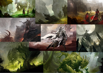
With the generation of ideas I'd gained from looking at, I gained the thought to create art that's based around forest areas, as I'd already done quite a bit of research into forestry areas, I wanted to work on concept art that would look somewhat like what Kekai Kotaki and Richard Anderson have previously created, but more focused towards Richards as he focuses on Environment art as Kekai does better with Character art.
Task 1 - Research
Environmental Concept Art For A Game
Choice of Environments
Fantasy based
- Forest areas

- Medieval based structures

- Overgrown terrain

- Mountainous areas

Urban Based
- Alleys, Streets, Roads

- Town Centers

- Shopping Districts

- Central Business Districts

Arid lands
- Desert areas

- Inhabitable places / Overgrown forests / Fallout Ridden Terrain

- Heavily snowed over terrain

- Grass Planes

Futuristic city-scape
- Towering techno-like skyscrapers


- Floaty cars

Environmental Artist
Kekai Kotaki

I personally like Kekais’ work as I’m a huge fan
of Guild Wars and the entire franchise and his concept art played a huge part
in that too.
Richard Anderson

Richard is a senior artist working in the entertainment industry for over 10 years. Projects ranging from film, games, commercials and publishing.
Clients have included: Marvel studios, Warner Bros., Universal Pictures,
20th Century FOX, Disney, NC Soft, Studio Canal, Samsung, Psyop, StarDust, and Random House.
Choice of Environments
Fantasy based
- Forest areas
- Medieval based structures
- Overgrown terrain

- Mountainous areas
Urban Based
- Alleys, Streets, Roads
- Town Centers
- Shopping Districts
- Central Business Districts

Arid lands
- Desert areas
- Inhabitable places / Overgrown forests / Fallout Ridden Terrain
- Heavily snowed over terrain
- Grass Planes
Futuristic city-scape
- Towering techno-like skyscrapers

- Floaty cars
Environmental Artist
Kekai Kotaki
Kekai Kotaki
lives in Seattle in the US currently as a freelance concept artist but has been
involved with such game companies as Bungie and more importantly Arena Net in
which he was hired as an artist to create loading screen images.
After
graduating an Art institute of Seattle, previously doing freelance snowboarding
graphics joined ArenaNet in 2003, he was the lead concept artist for Guild Wars
2 until leaving the company in June 2012 in which he now resumes his freelance
design jobs.
Richard Anderson
Richard is a senior artist working in the entertainment industry for over 10 years. Projects ranging from film, games, commercials and publishing.
Clients have included: Marvel studios, Warner Bros., Universal Pictures,
20th Century FOX, Disney, NC Soft, Studio Canal, Samsung, Psyop, StarDust, and Random House.
Real life research
Subscribe to:
Comments (Atom)


